

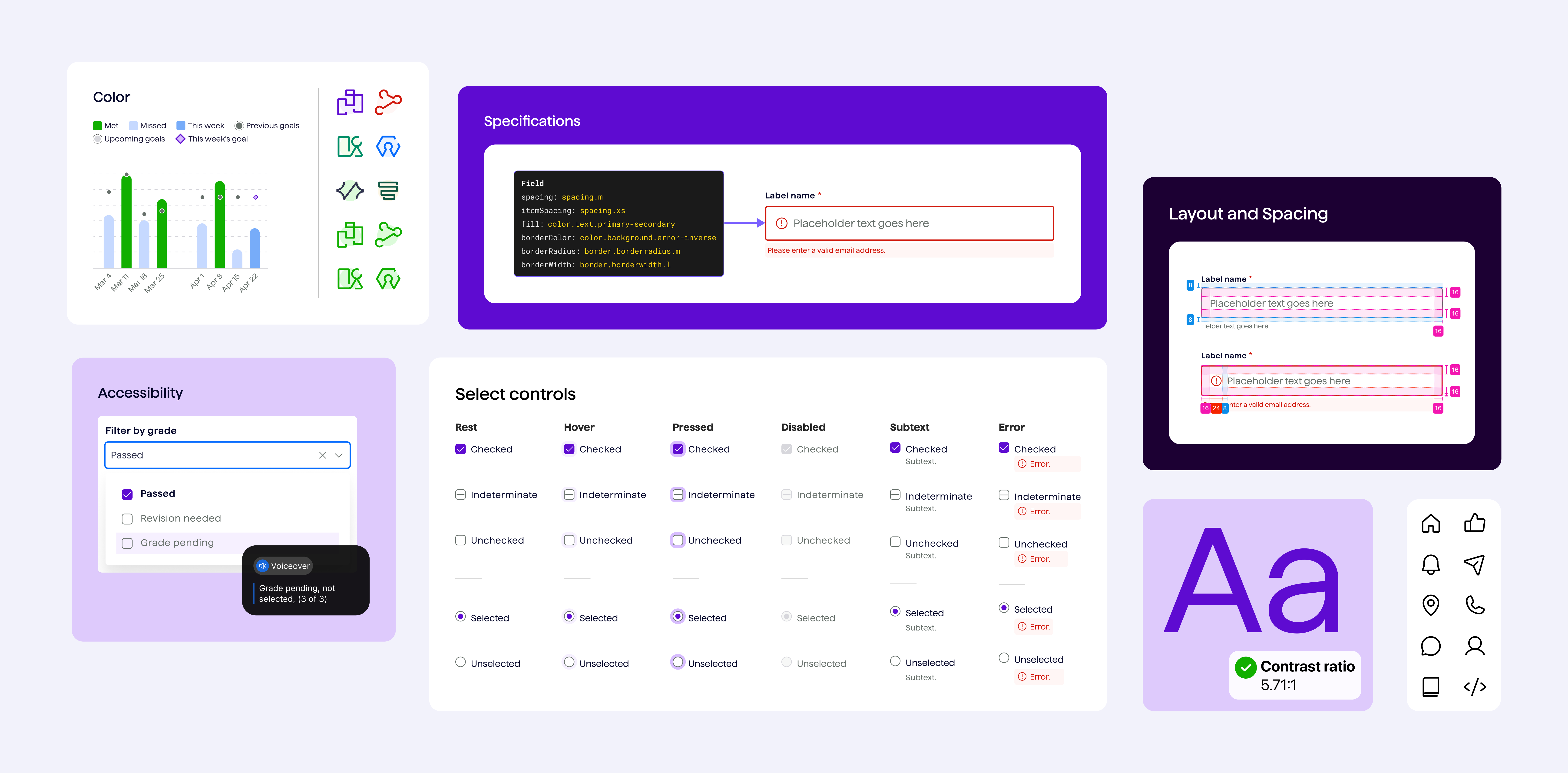
In 2023, Springboard introduced a new visual identity designed by Milkshake, a branding agency focused on the company’s marketing website. While the rebrand established a fresh visual direction, our learning platform needed its own design system to support more complex, interactive experiences.
Our three-person product design team partnered with engineering and Rangle, a design system consultancy, to build that foundation. We needed to adapt the new brand into accessible, reusable components while establishing a shared process for designing, documenting, and developing them.
I helped build the design system from the ground up, focusing on researching, designing, and documenting reusable components.
My work included developing component variants and interaction patterns, addressing accessibility challenges, creating detailed spec documents for engineering, and helping establish documentation and governance practices.
I also helped shape our move from Figma-based documentation to Supernova, creating the initial architecture to make component guidance easier to maintain and navigate.
10 reusable components published across our three-person design team
1 shared Figma UI kit establishing the initial product component library
Component specs and review workflows supporting design-to-development handoff
Initial Supernova documentation structure to support future system growth
Although the broader rollout was interrupted by team layoffs in December 2023, we established a foundation for more consistent product design and development. I continued some of the work independently afterward, before other product initiatives took priority.
We followed an atomic design approach, starting with foundational styles and design tokens before building reusable components, patterns, and eventually larger features and layouts.
Our design manager primarily led the token architecture, translating the new brand’s visual styles into a structured foundation. I worked alongside the other designers to turn those foundations into components that could support real product interactions.
Rangle helped us establish the initial design system approach and working practices, which our internal team continued developing.
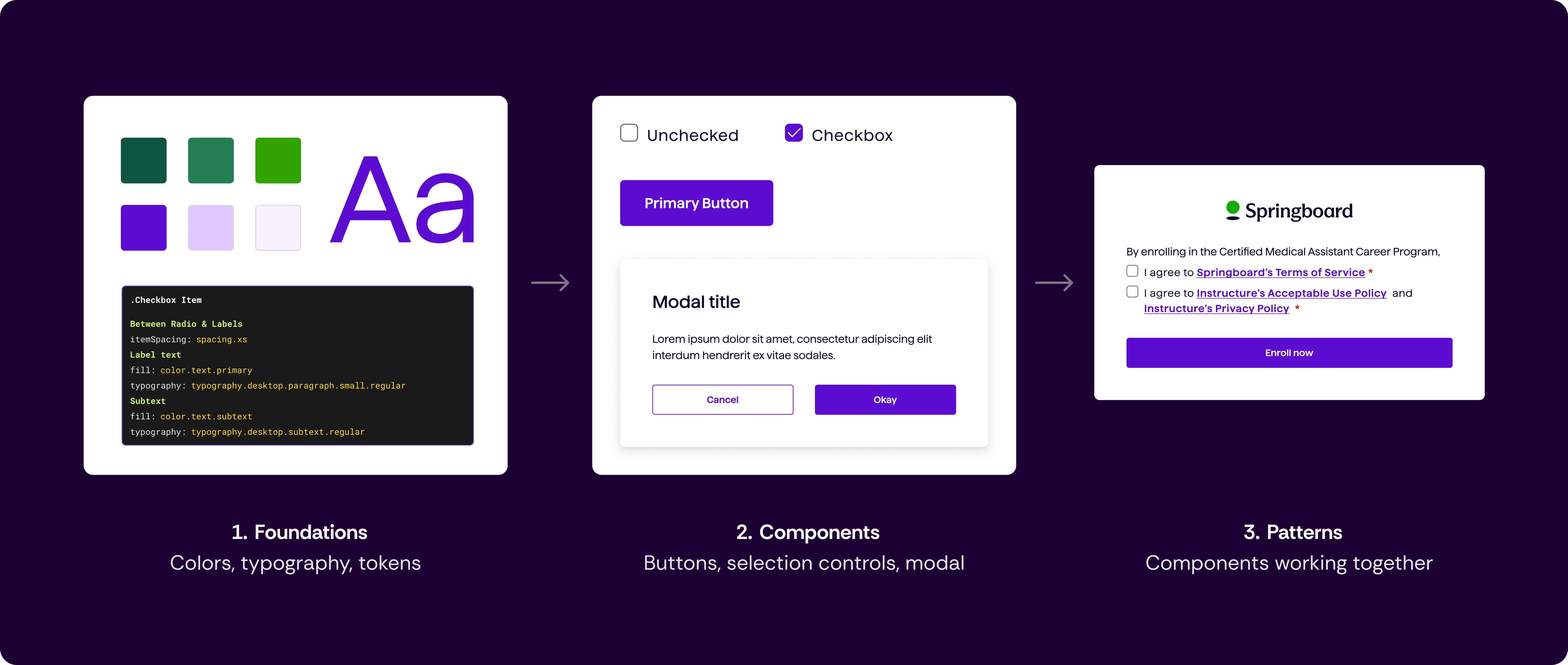
How foundational styles and tokens came together to form reusable components and patterns.
One of our biggest challenges was adapting the new brand colors to meet accessibility requirements across the learning platform.
For example, our checkbox designs initially used green and red to communicate different states, following the direction established by the rebrand. But as I explored variations across light and dark backgrounds, contrast testing revealed that many combinations didn't meet accessibility requirements.
I tested alternative colors and interaction states, eventually helping the team settle on purple hues that offered better contrast, particularly on dark green backgrounds. Since we were no longer relying on red checkboxes to indicate errors, we added an error icon alongside the message below the field to make validation issues easier to recognize.
This was one of many decisions where accessibility pushed us to look beyond the original brand guidelines.
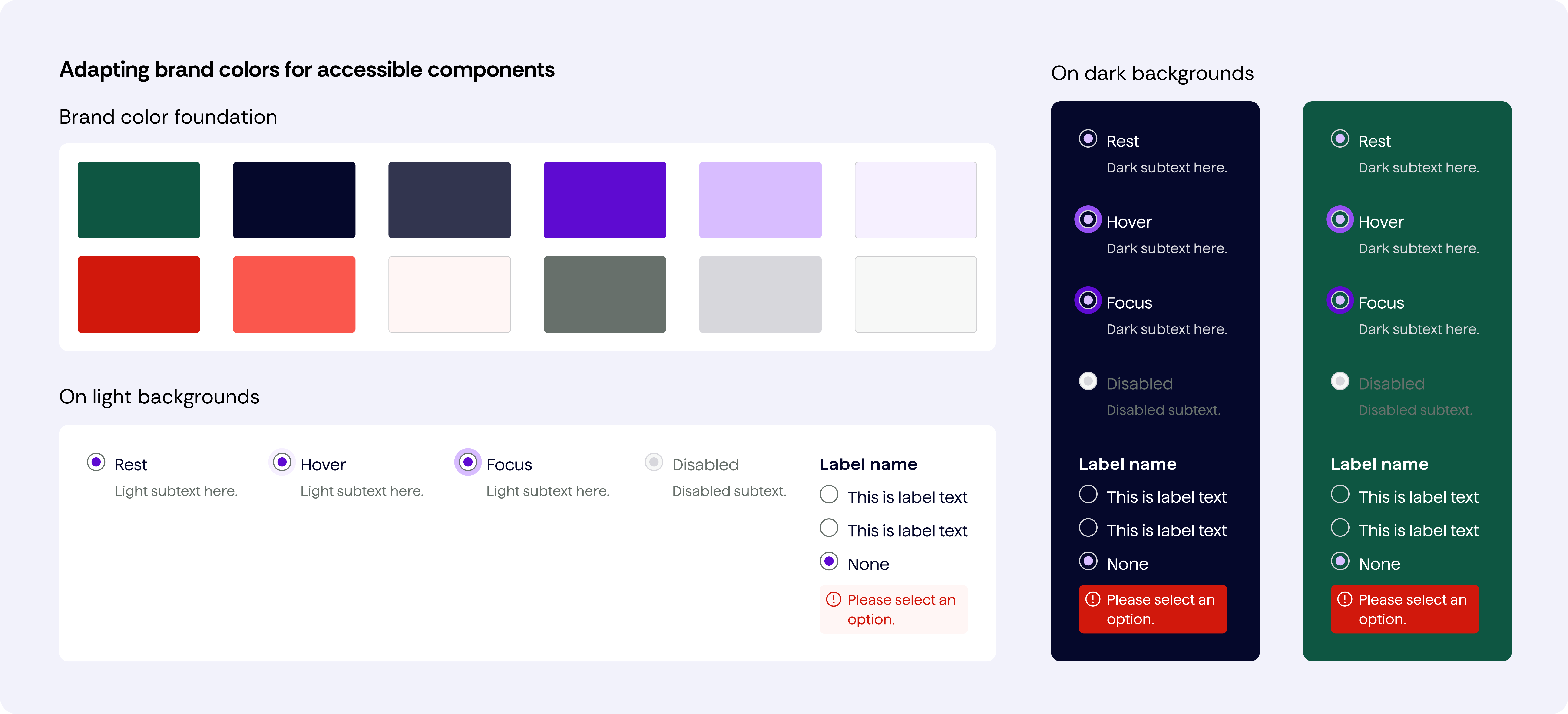
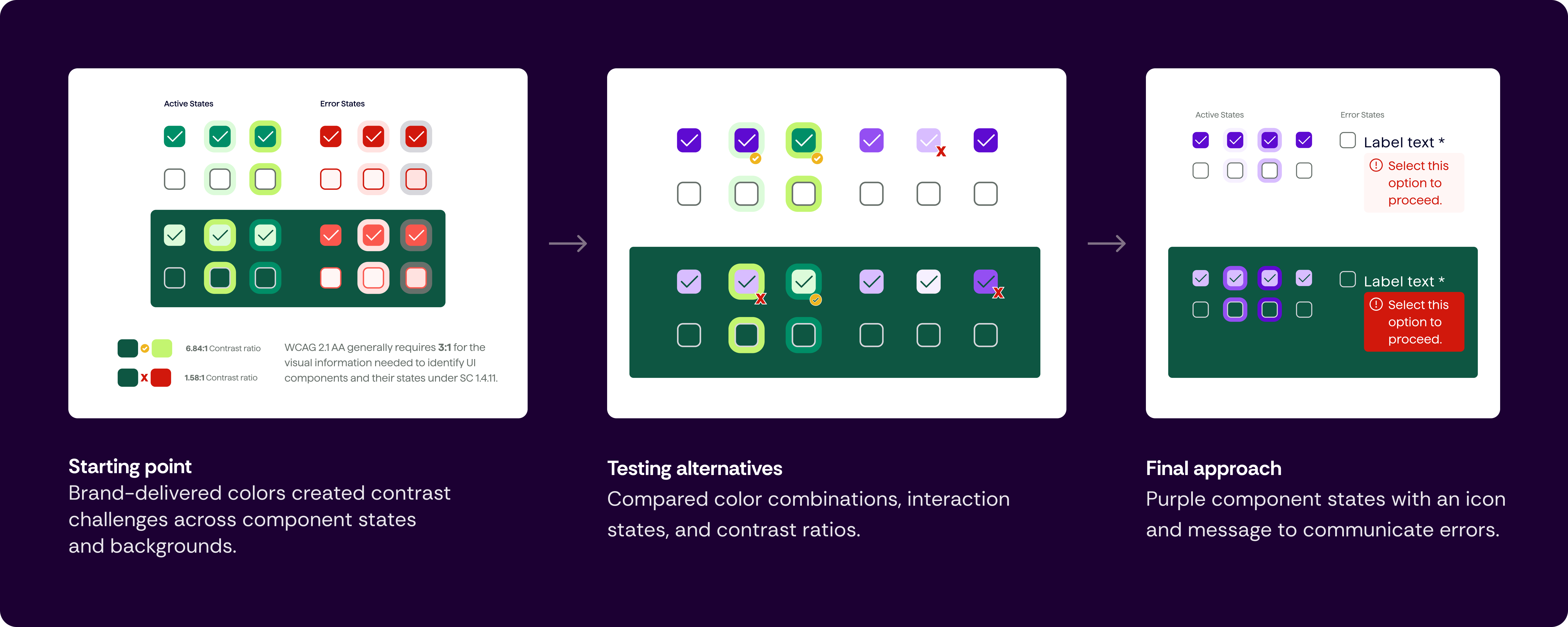
From brand colors to accessible states: how contrast testing shaped our checkbox designs and error messaging.
Building reusable components meant thinking through more than their visual states. We had to account for different use cases, interactions, and behaviors to make sure each component worked consistently across the learning platform.
One of my most involved projects was designing radio buttons and checkboxes. I spent nearly a month researching, exploring, and designing them, from variants and properties to working through keyboard interactions and responsive behavior.
At this point, I could probably teach a whole class on radio buttons and checkboxes!
The process taught me how much detail goes into even the simplest-looking components, especially when they’re intended to be reused across an entire product.
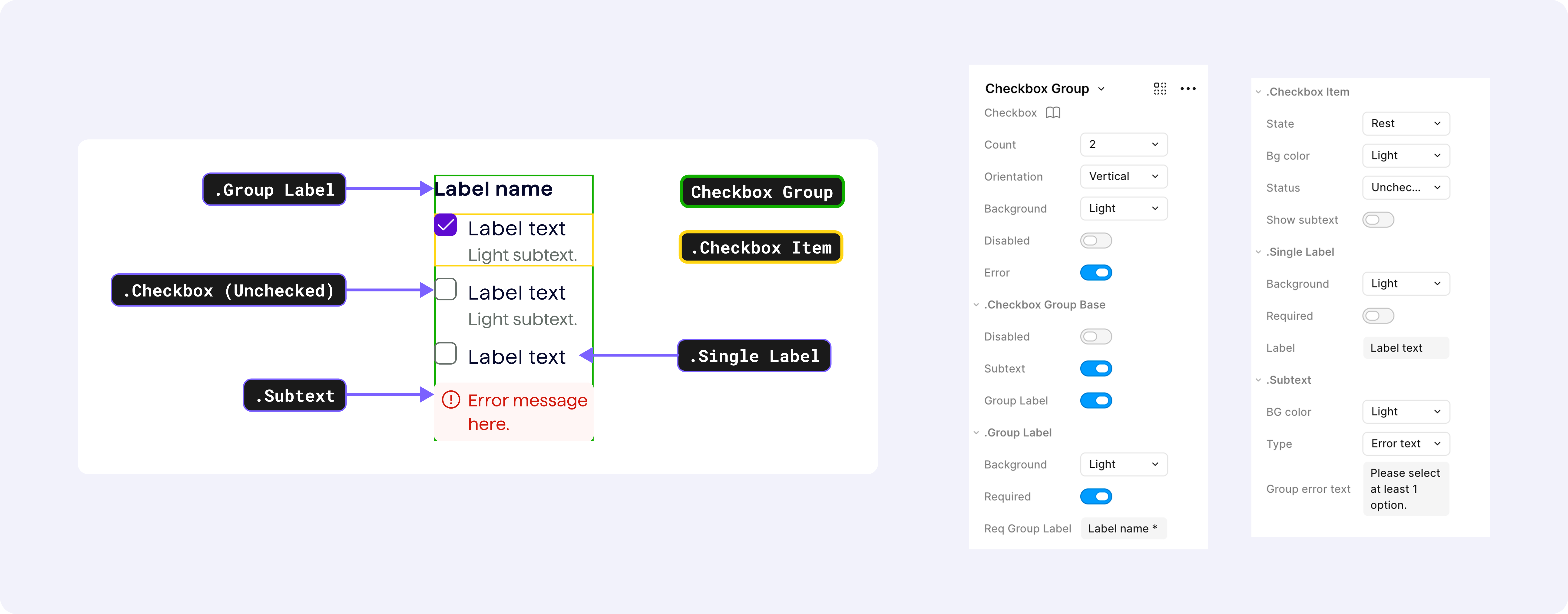
Breaking down checkbox groups into reusable elements with configurable properties, states, and behaviors.
Alongside the Figma components, I created detailed specification documents to support implementation.
These included spacing measurements, design tokens, variants and properties, responsive behaviors, and interaction states. I also documented accessibility requirements such as keyboard navigation, expected keyboard interactions, assistive technology (screen readers), and color contrast.
The specs helped engineers understand how components should behave beyond their visual appearance. I also worked with engineering to review implementations and identify differences between the designs and developed components.
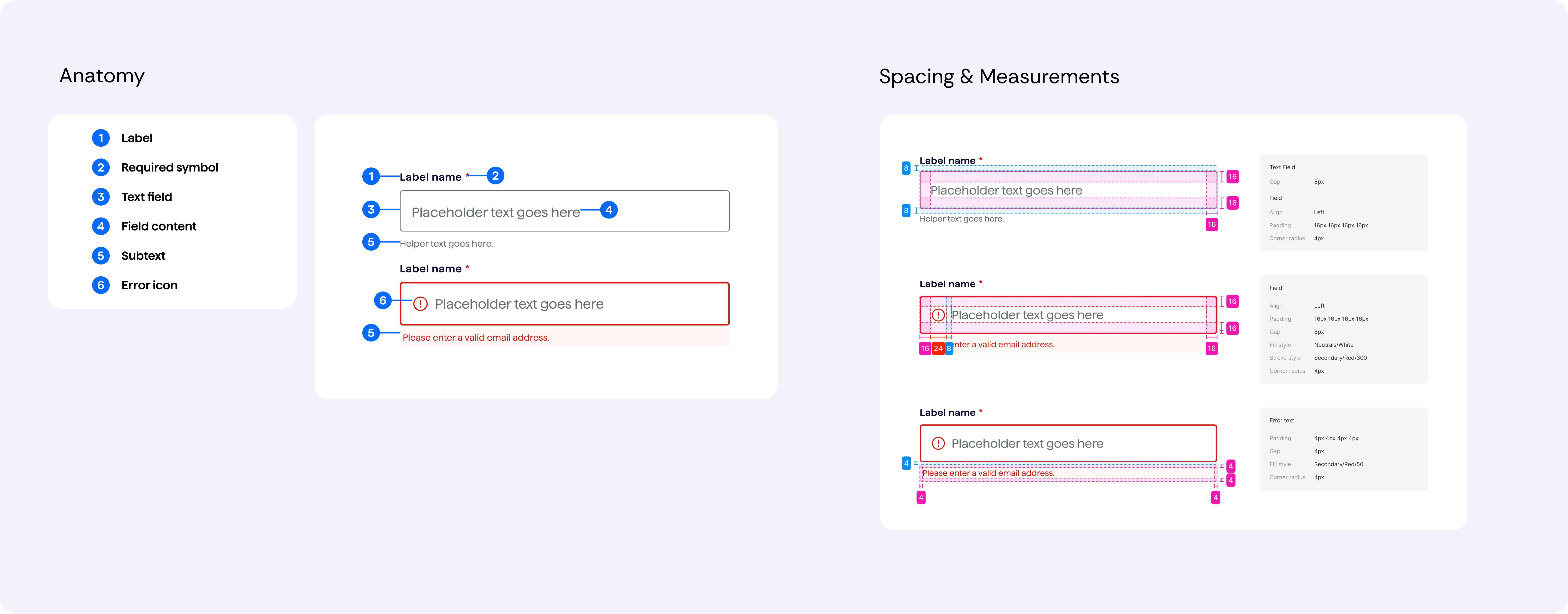
Breaking down text field anatomy and spacing to guide consistent component implementation.
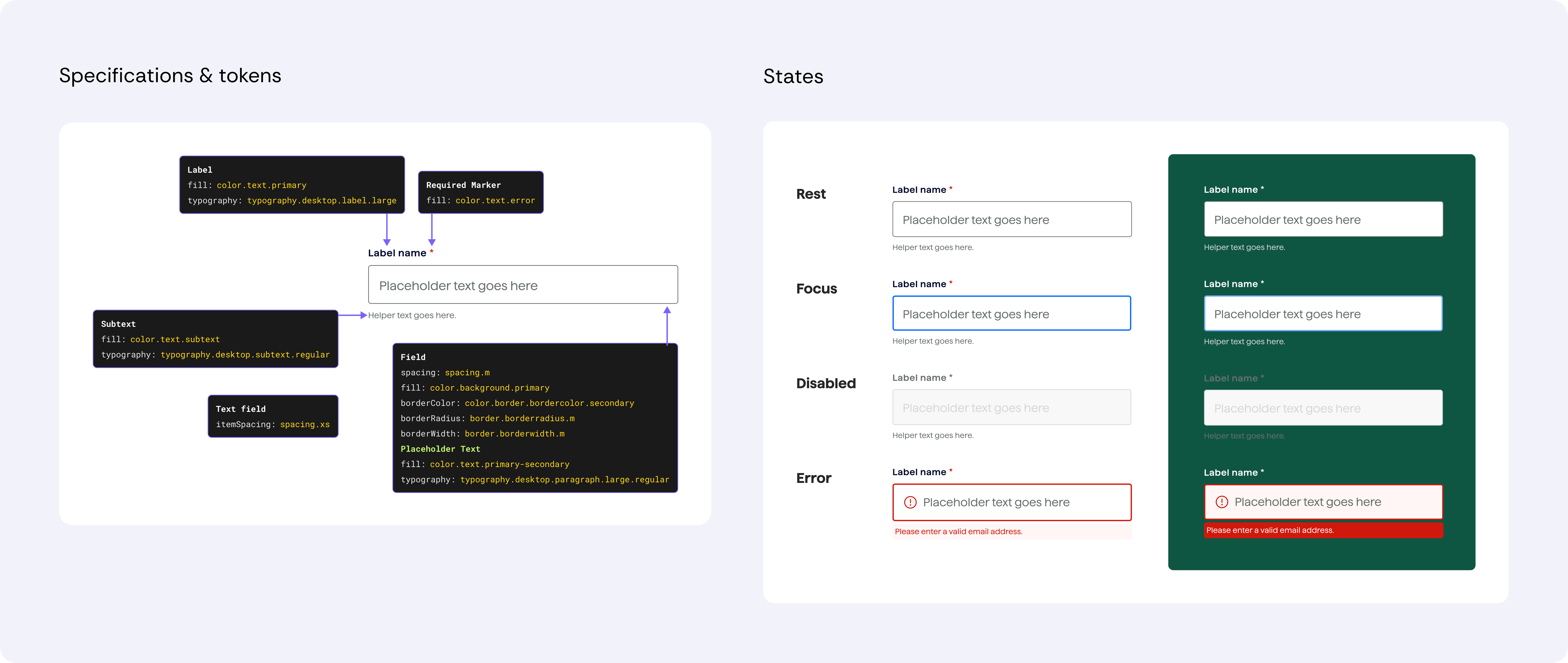
Documenting design token references and interaction states for consistent implementation across light and dark backgrounds.
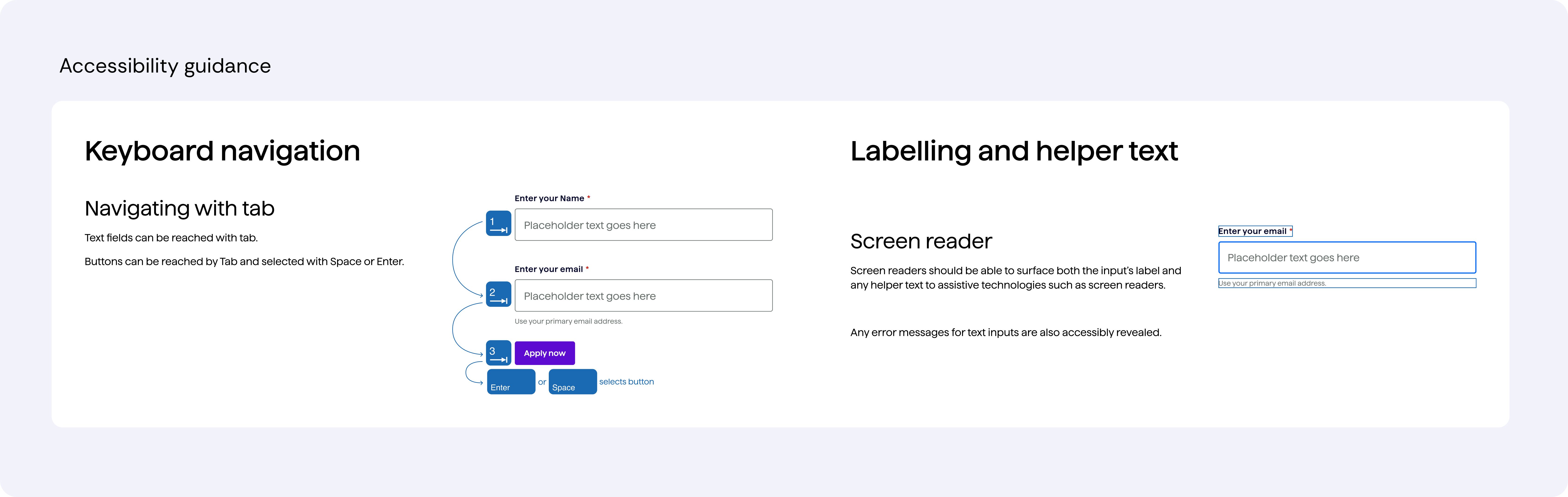
Accessibility specifications covering keyboard navigation, screen reader support, and accessible labeling and helper text.
We initially created component documentation directly in Figma, but designing and maintaining these pages became increasingly time-consuming.
We began exploring Supernova as a shared documentation platform, starting with workshops to understand what different teams needed and how the content should be organized.
I helped develop the initial site structure, organizing content around foundations, components, patterns, guidelines, and resources. The goal was to make specifications, guidelines, and component resources easier to maintain and find without recreating documentation layouts for every component.
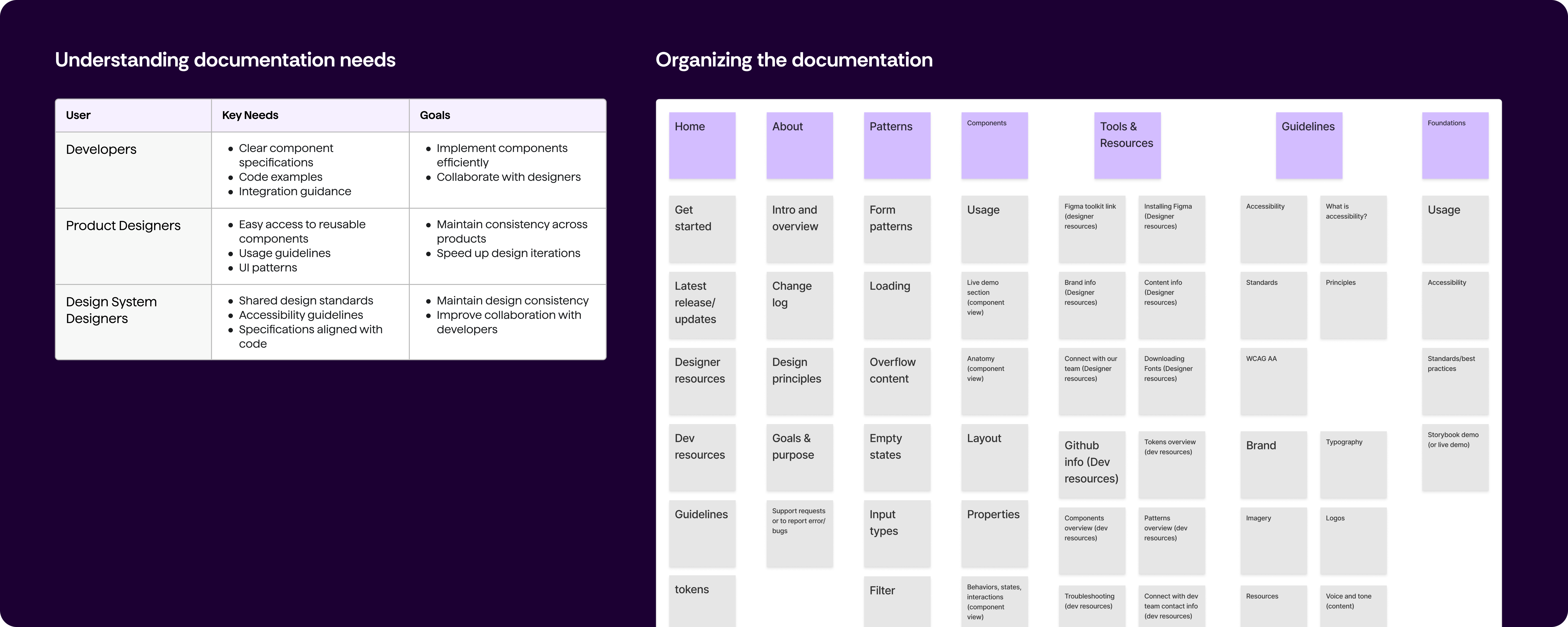
Mapping documentation needs across teams and organizing content to make design system resources easier to find and use.
By the end of 2023, our team had published 10 reusable components and established an initial design system foundation for the learning platform.
The project was still growing when the team was reduced. I continued some of the work independently, but it was eventually deprioritized as other initiatives took precedence.
This experience gave me a deeper understanding of what it takes to build and maintain a design system. I learned how much research and collaboration goes into individual components, how accessibility influences system-wide decisions, and why documentation and governance are just as important as the components themselves.
